Compassionate UX for Full Cycle of Kidney Dialysis Management
Beans app is a service designed to support the life cycle of patients with chronic kidney disease. We were tasked with redesigning the app to provide patients with easy and patient-centric access to their medical information. Over time, the app evolved into a platform that facilitates two-way communication between patients and healthcare professionals, improving the overall healthcare experience.
Users faced challenges in discovering, navigating, and accessing health data on the Beans App due to its inconsistency and lack of a centralized data hub.
Through user research, we discovered the problems of low discoverability, inconsistency, and inefficiency. The flow of the app was confusing and challenging to navigate, and the presentation of data was not user-friendly. There was no centralized place for users to access their health data on the Beans App.
1. Enhance the site infrastructure to streamline user flows and improve the accessibility of key functions.
2. Personalize the healthcare management experience for users.
3. Boost app attendance rate, user retention, and overall user engagement.
We began by conducting two separate surveys on the platform—one targeting patients and the other aimed at healthcare professionals—to gather valuable insights into their priorities and preferences. With 184 survey responses in hand, we followed up with five in-depth, semi-structured interviews to gain a deeper understanding of their needs and pain points. This research helped us define the key challenges users face and laid the foundation for designing targeted solutions that address their specific needs effectively.

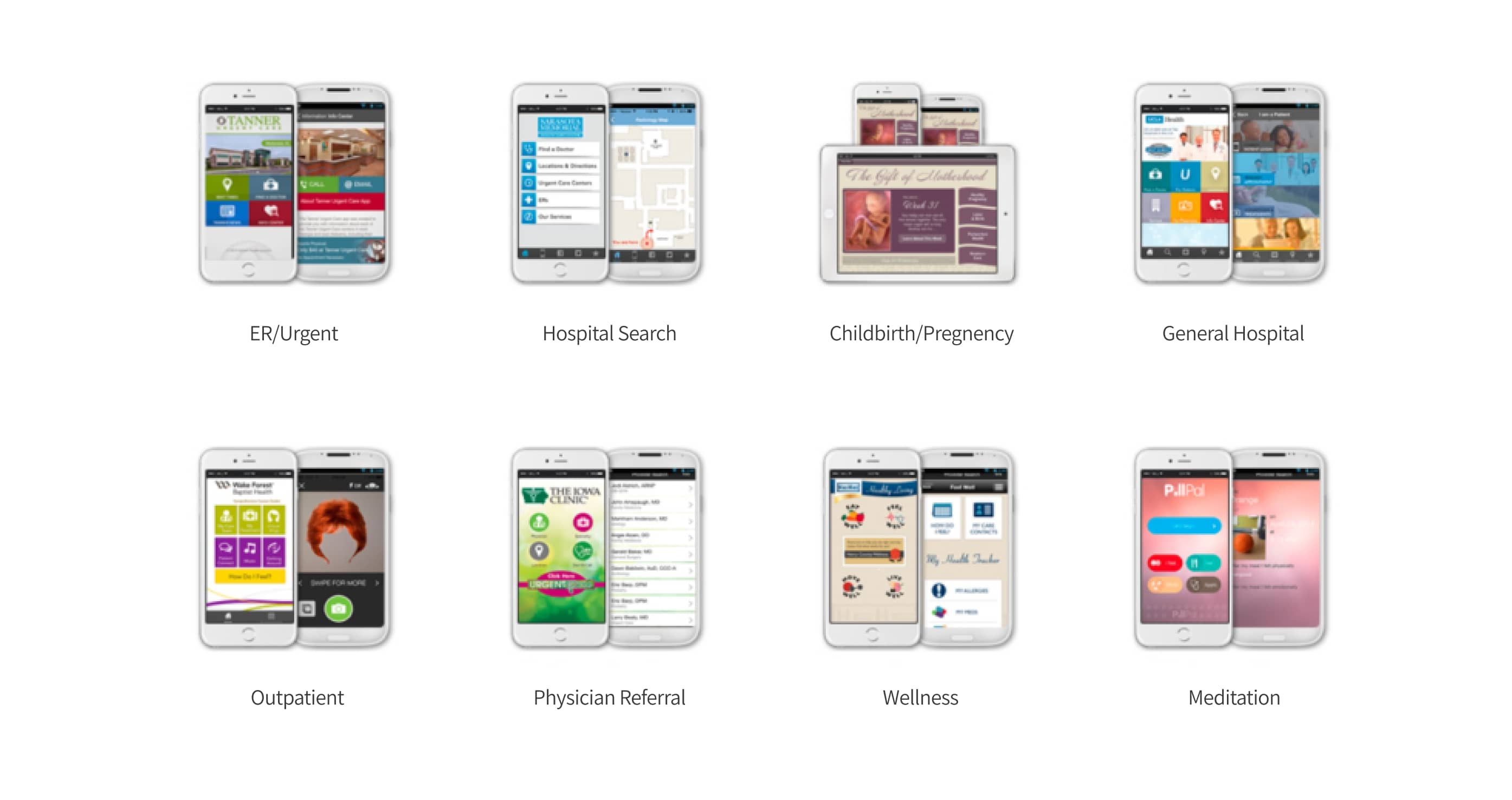
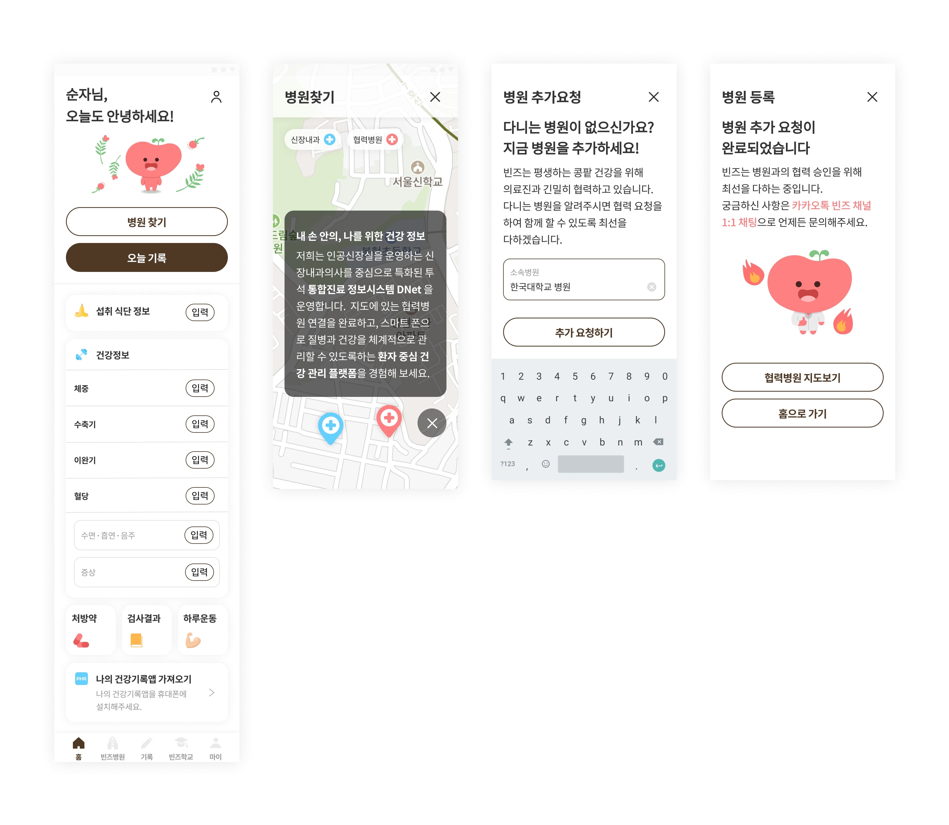
Based on our research into competitors' app services, we identified several key insights: We recognized the need to reorganize core features with a patient-centric approach, such as improving access to EHR/EMR (Electronic Health/Medical Records), and enhancing functionalities for appointment scheduling, cancellation, rescheduling, and prescription refill processing. We also noted the importance of prioritizing data items and ensuring consistency in notification screens based on data status (e.g., "None" or "Receiving"). Additionally, we found that grouping quick links in a centralized location and using icons to prioritize them could significantly improve user navigation and accessibility.
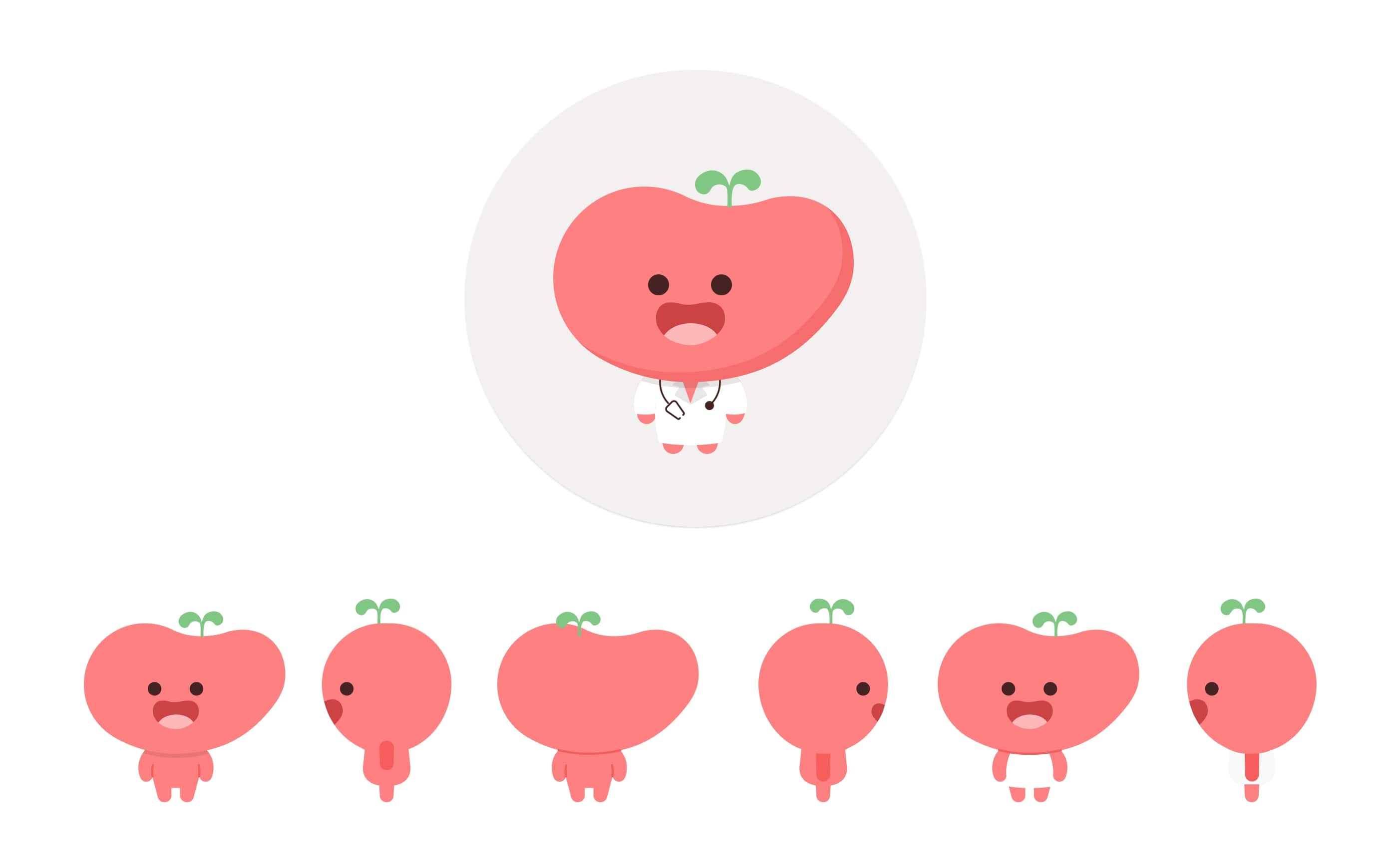
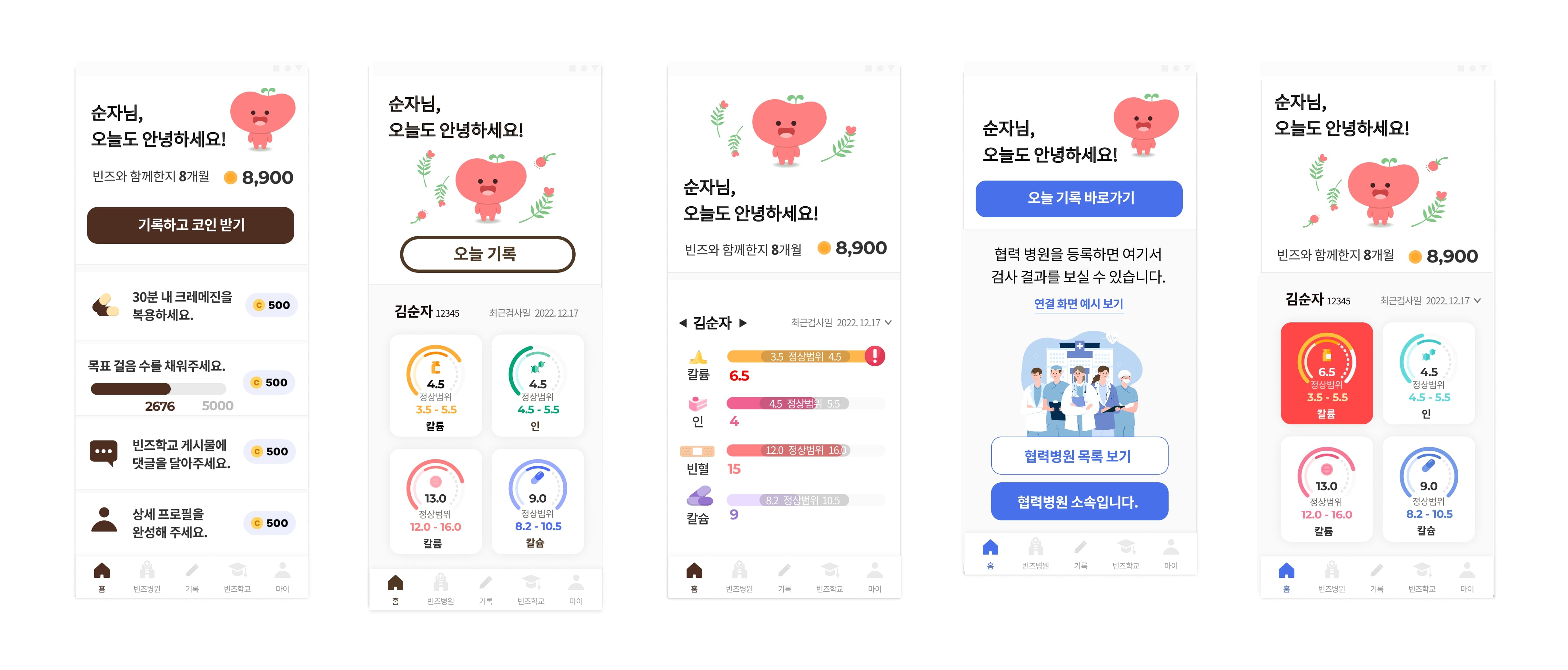
Based on our research, I discovered that both healthcare professionals and patients rarely use the app, as it is more convenient for them to check information directly at the hospital. However, chronic kidney disease patients need real-time management even outside of the hospital. To address this issue, I decided to introduce a digital companion feature, where the app interacts with users in a digital space and rewards them for their engagement, ultimately increasing user retention.
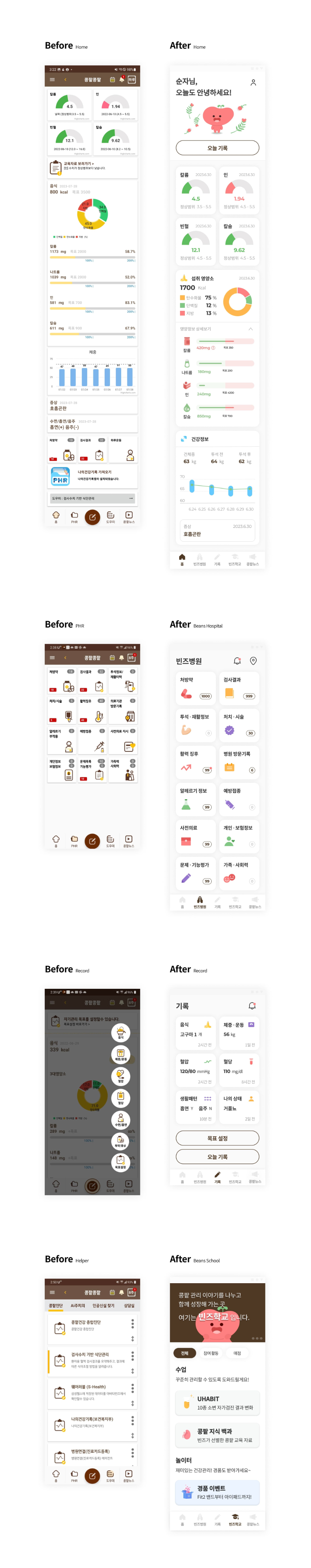
We invested considerable time in finding the most efficient way to present information on the home page, the first page users encounter after logging in. To identify the crucial information for display, I collaborated with the team and conducted user research, seeking their input on users' priorities.
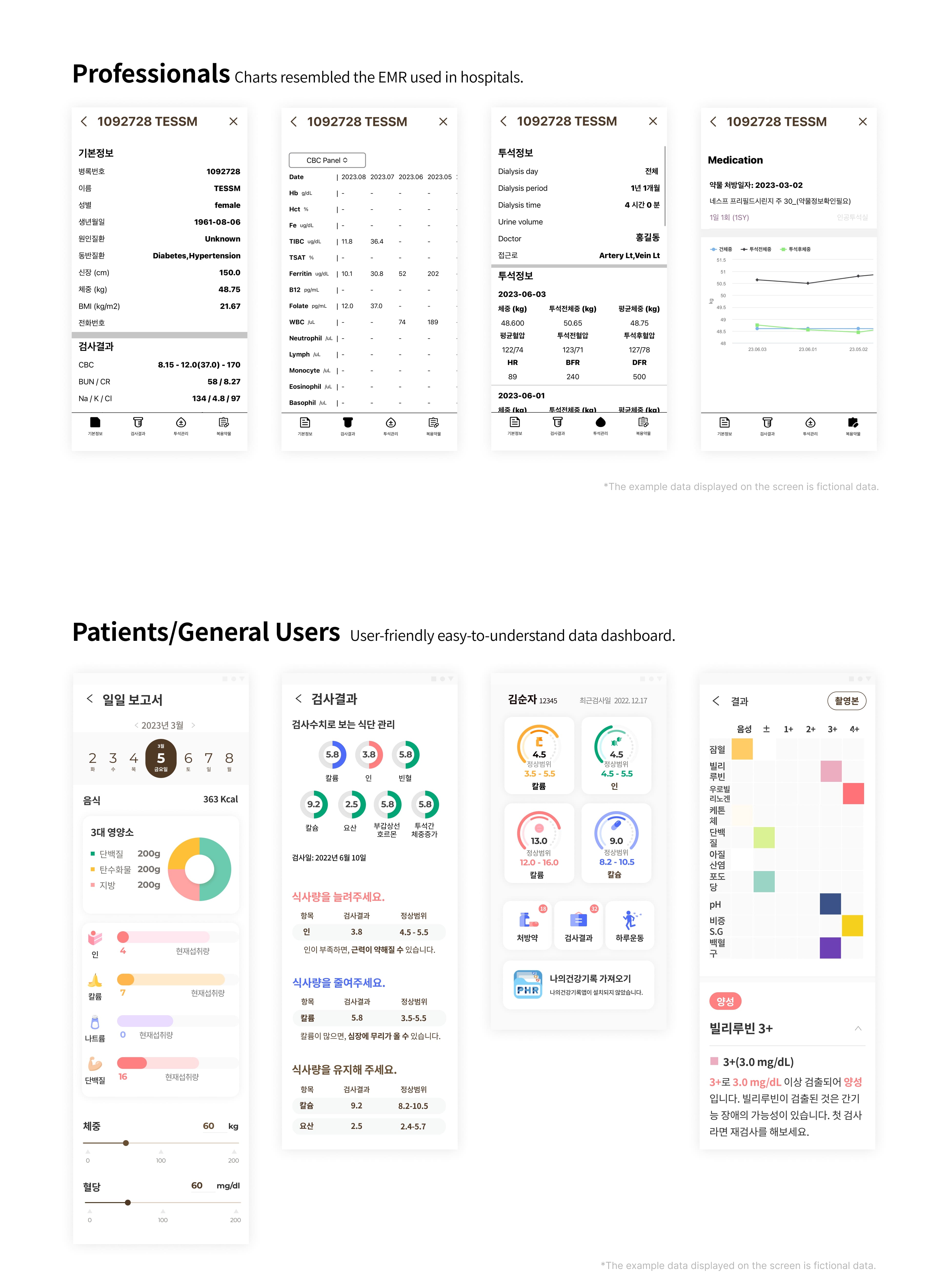
To streamline engineering efforts and enhance the app's usability, I focused on maintaining design consistency for both patients and healthcare professionals. While the dashboard for healthcare professionals resembled the EMR chart used in hospitals, I refined the medical data presentation for patients to create a seamless experience. By doing so, We aimed to improve the overall user experience on the patient side.
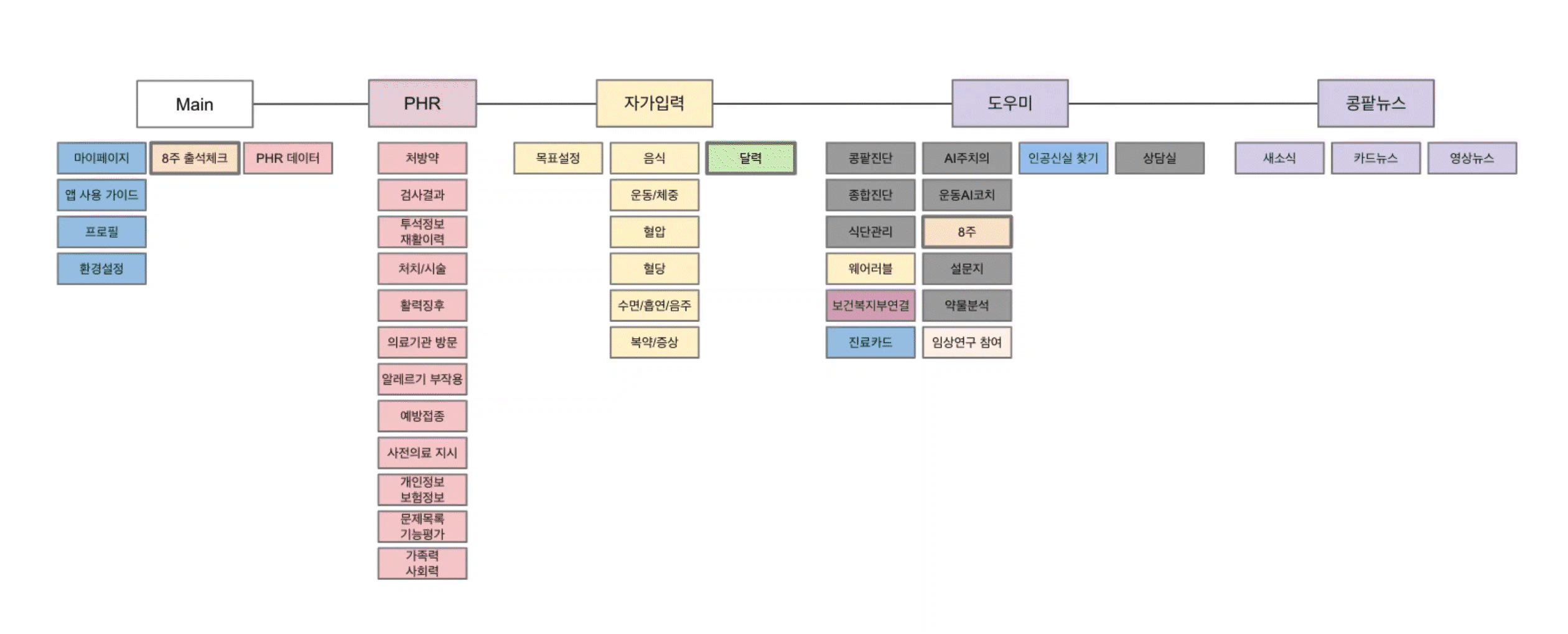
By redefining functions based on user priorities and mapping key functions to existing ones, I increased communication efficiency and collaboration with stakeholders. The use of key function mapping allowed me to organize and visualize the newly added features in a clear and concise manner, leading to improved communication with collaborators and effective collaboration with stakeholders.
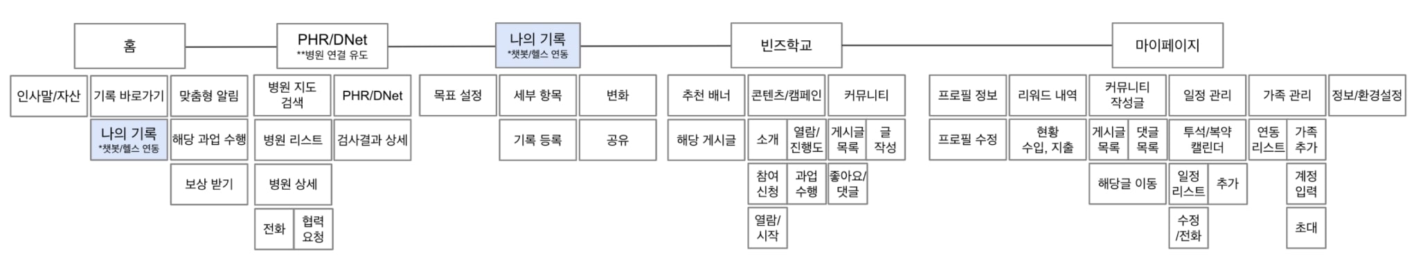
The information architecture was newly derived and validated through collaboration with various stakeholders, ensuring that duplicate items were not overlapping. We worked closely with backend software engineers to design the frontend data structure that aligns with the efficiency of the server's database. This enables users to access user-centric data more effectively, enhancing the overall user experience.
We developed a clickable prototype in Figma and conducted usability testing to gain a deeper understanding of how users interact with the new interface. Over a two-week period, we completed 20 tests with both existing users (healthcare professionals and patients) and new users. To ensure effective testing, we carefully planned the user testing process and designed a variety of tasks within the prototype. During testing, we observed users completing tasks via screen sharing on Zoom and gathered feedback afterward. The results were positive, highlighting areas for improvement, which we later incorporated into the final design. The experience of engaging with users and observing their reactions to the new design motivated us to prioritize user needs in our design decisions.
1. Improve responsiveness on mobile and tablet
2. Design empty states to be more intriguing
3. Implement further customizations
The biggest challenge was meeting the needs of both patients and healthcare professionals while improving the app's usability. Simplifying accessibility and user flow for both patients and healthcare professionals was the core challenge of this project, and user research, competitive analysis, and close collaboration with stakeholders played crucial roles in finding solutions. One of the key solutions was introducing a digital companion feature to enhance user engagement. Additionally, improving the presentation of medical data for patients in an intuitive and user-friendly way was a significant achievement. While designing the lifecycle experience, I was particularly able to guide users to interact with the app in a more intuitive and friendly way through the digital companion feature, which helped increase user retention. Throughout the UX/UI design process, I deepened my understanding of how to improve user experience and realized the importance of continuous feedback and iteration. Moving forward, I will continue to learn and evolve by adding innovative elements, such as digital characters, and finding new ways to further enhance the user experience.